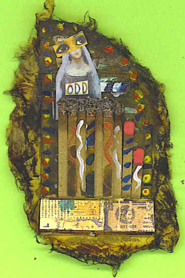
This a very Zetti matchbook shrine (#2). Liked the lighter values on the top and bottom. The eyes worked for me. I seem to be using red a lot for contrast and to pull the eyes in. I guess red is my repeating element.


| Info on affordable web promotion service. |
1 comment:
I love the bright paint=> it feels primitive and the contrast with the red matches!
Post a Comment